Color scheme in American Beauty

I’ve seen American Beauty at least 50 times, but even after so many views, there is always something new I haven’t noticed before.

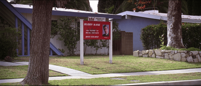
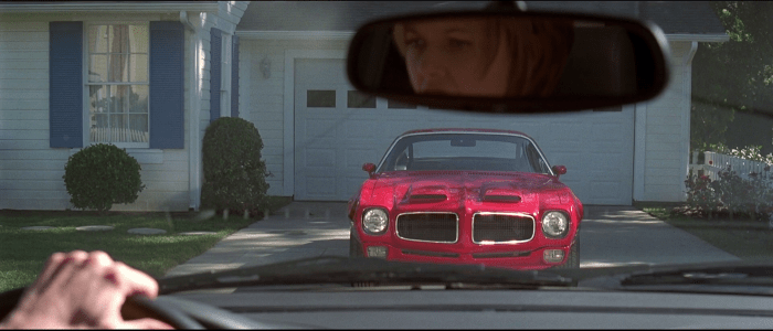
I was always aware of the color red appearing repeatedly in the movie – red is the color of roses present in several scenes, Lester’s new car (1970 Pontiac Firebird), door of Burnham’s house etc., but only recently, I noticed this color scheme: Red, blue and white. It’s hilarious how often these three colors appear simultaneously on the screen in various combinations and in various forms throughout the whole movie. Here are some examples:

Lester’s office (notice for example the handles of scissors on the table),

American Beauty (1999)

Lester’s suitcase (notice the color of papers and folders),

American Beauty (1999)

but probably the most noticeable is the Burnham’s house.

American Beauty (1999)

White walls, blue window shutters and red door. The same color scheme is found also inside the house.

American Beauty (1999)

I’m not sure what these colors mean, what do they represent and why, but they were used without any doubt on purpose. The importance of color further proves one of the first sentences of Lester Burnham: “That’s my wife Carolyn. See the way the handle on those pruning shears matches her gardening clogs? That’s not an accident.”

Maybe the color scheme shows certain stereotype, or materialistic world of Lester’s wife Carolyn (she wears colors matching the colors of their house – red, white and blue – and gets furious and angry when Lester – almost – spills the beer on the couch).

Honestly, I don’t know, what does the color scheme of red, white and blue mean. But sometimes, the questions are more important than answers. Maybe Sam Mendes doesn’t know either, or does he?
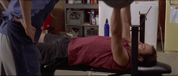
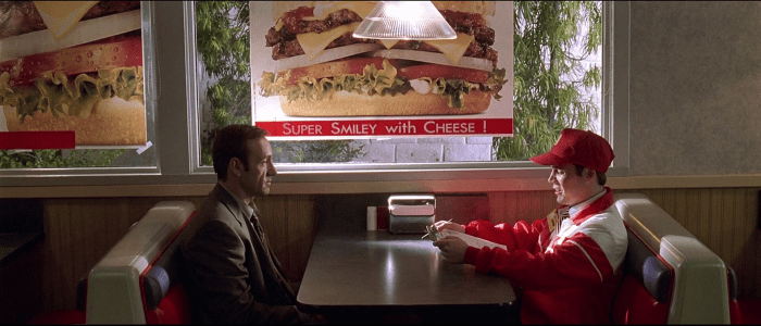
Other examples

P.S. There is a short article trying to answer, what does the color RED mean in the movie, well worth reading!

Color Contrast Enhancement in Se7en

Se7en (1995)
Se7en (1995)

I love when certain technique gets used on purpose – when it is used not only because you can, but because it helps to tell the story, and color contrast enhancement (CCE) in Seven is exactly that case.

Detective William Somerset (Morgan Freeman) is at the end of his career, but he gets one last case to solve, together with young detective David Mills (Brad Pitt), he is searching for serial killer John Doe (Kevin Spacey), who kills his victims on the basis of seven deadly sins.

The overall atmosphere of the movie is literally dark. First, the serial killer John Doe is brutal and fanatic, but at the same time, he is very clever, intelligent and accurate – I can hardly imagine worse villain than him (Joker from Batman gets honorable mention here). Second, most of the scenes happen in dark interiors, in certain scenes, you’ll see only flashlights of the detectives.

Se7en (1995)
Se7en (1995)

But outside it doesn’t look any better. Dirty, violent and depressive city, where it constantly rains.

Se7en (1995)
Se7en (1995)

To further support this dark mood and atmosphere, some theatrical prints were created using silver retention process. This technique increases the contrast – it makes dark areas darker and light areas lighter (similar to blending mode overlay). In other words, the blacks are more black. Further, this technique adds more grain to the film print. Maybe you haven’t noticed this effect at first (I haven’t), but you can certainly feel it on emotional level. So long story short – CCE increases the contrast (drama) and grain (roughness).

P.S. I’m almost 100% sure, that the director David Fincher and cinematographer Darius Khondji discussed the CCE technique before they shot the movie. This only proves, that David Fincher knows how to tell a story in a cinematic way.

You don’t always need dialogue to tell a story

WALL·E (2008)
WALL·E (2008)

If you are following Pixar on Twitter, or if you are their Facebook fan, you’ve seen this picture before. Beautiful picture with no description, yet the meaning and emotion are somewhat clear – the characters are in love.

People working at Pixar think a lot about colors used in their films. It is by no coincidence, that certain scenes in their movies use warm or cool colors, that some scenes are desaturated or in vivid colors. Color is an extremely powerful tool to tell a story, because with color you can:

  • set the mood
  • define character
  • draw attention to certain objects/people
  • describe emotions
  • convey meaning
  • (and many other uses which I forgot or don’t know about)

Color is in some ways very similar to music. If you look at the list above once again, you’ll realize, that you can basically do the same with music, because color and music share many similarities: Both of them can be described in terms of contrast, color, depth, tone and many other characteristics. Nevertheless, there is one characteristic, which is exactly the same for color and music –  the ability to deliver the mood or emotion instantly, to create visceral emotional response in the viewer/listener. In this introductory article dedicated to color as a storytelling tool, I want to focus on the first item in the list – the ability of color to set the mood.

The very first picture in this post is artwork that comes from movie Wall-E. Because Wall-E is robot with a very limited language skills, people from Pixar couldn’t convey the meaning in this scene using dialogue, so they did it using color palette. All of the colors in the scene (except the light bulbs around EVE) are warm colors – red, brown, yellow, pink, orange. The colors are there mainly because of the sunset (chosen on purpose), but more importantly, on emotional level they tell us, that Wall-E is in love with EVE.