Vertigo shot

We can define Vertigo shot (also known as dolly zoom) as a movement of camera on dolly while changing the focal length of the lens. In other words, moving the camera physically away or towards the subject (“dollying”) while zooming in or out (changing the focal length of lens).

I made a short animation, which hopefully clearly shows the difference between:

  • Change in focal length (zooming in)
  • moving the camera physically away from the subject (“dollying out”) and
  • what happens, when these two techniques are combined (=dolly zoom).

When “dollying out” and zooming in, the size of red figure stays relatively the same, but the background changes dramatically. This is very unsettling, because our eyes are not used to this. The reason for that is that with our eyes, we can perform only the dolly part of the move, that is, physically moving away or towards the subject, but we can’t zoom with our eyes (wished we could 🙂 ).

Anyway, this technique was firstly used, I believe, by Alfred Hitchcock in his film Vertigo. And it was used in such a way, that it helps to tell the story. The movie starts by a chase on roof tops, and it is here, when we learn, that one of the main characters, detective Ferguson (James Stewart), suffers from acrophobia (fear of heights). Here is the scene:

He jumps from one roof to another,

Vertigo (1958)
Vertigo (1958)

but slippers and almost falls down.

Vertigo (1958)
Vertigo (1958)

When he looks down, he gets dizzy/vertigo. Here uses Alfred Hitchcock the dolly zoom technique for the first time in the movie – he shows detective Ferguson’s fear of heights and how he feels.

Vertigo (1958)
Vertigo (1958)
Vertigo (1958)
Vertigo (1958)

The foreground stays relatively the same (top and bottom of the frame), but the background (middle of the frame – ground) changes dramatically.

The dolly zoom technique gets used again in a scene, where detective Ferguson is chasing Madeleine (Kim Novak) on old wood staircase.

Vertigo (1958)
Vertigo (1958)

In the middle of the staircase, he looks down an gets dizzy/vertigo again.

Vertigo (1958)
Vertigo (1958)
Vertigo (1958)
Vertigo (1958)

Again, the foreground (his hands) stays relatively the same in size, while the background (floor of the tower) changes dramatically in size.

When I saw the movie for the first time, I didn’t know anything about zooming, or “dollying”, but I remember, that I could feel his (detective Ferguson’s) fear of heights in this scene. Watch the whole scene in the video below:

Vertigo is, to my knowledge, the first movie where this technique was used (as a storytelling device), but it is certainly not the only one. As I became aware of this technique, I started noticing it in other movies as well. It is usually used to:

  • show character’s physical/mental condition
  • depict change in her life, or
  • when she realizes something
  • when she finds herself in danger

Do you know about any other examples? Let me know down in the comments. 😉

Useful links:

The “Vertigo shot” and the oneiric narrative

Color palette in The Incredibles

moviebarcode.tumblr.com

Looking at the movie bar code of Incredibles doesn’t seem like anything useful at first glance, but trust me, there is a story hidden in those bars, so let’s take a closer look…

The Incredibles (2004)

The first set of pictures is basically random selection of screenshots from the beginning of the movie. On the movie bar code (above), I marked it as a “PART 1”. These were the glory days of superheroes, fighting crime in the city and saving people’s lifes. And those glorious times are further depicted by the color palette. The colors used in the first few scenes are highly saturated – full of live and energy.

But then, there was the lawsuit against all superheroes in the city. They were forced to stop using their superpowers and fit in with the rest of the citizens. So Bob (one of the main superheroes) starts working at insurance company and experiencing the “normal” life.

The following set of pictures was taken after the lawsuit, marked as a “PART 2” on the movie bar code.

The Incredibles (2004)

The colors are now desaturated and muted. The prevailing color from these scenes is grey/pale green/brown (also visible on the movie bar code above).

Hopefully you can see now, what happened in terms of color palette- from highly saturated colors at the beginning (saving people’s lifes, fighting crime, basically doing what superheroes are meant to do), to desaturated, pale and muted colors after the lawsuit (having a boring job and “normal” life).

In this case, the color palette was used to document change of Bob’s life, when he had to stop using his superpowers and get a “normal” job, but I can easily imagine using this change in color palette in various different situations – the most obvious one would be being with someone who you love and than losing him/her. Or… (type in the comments below).

Links


P.S. If you’d be interested in other example of cinematic storytelling in Incredibles, here is an article I wrote back in February 2012.

P.P.S. The movie bar of Incredibles can be found here: moviebarcode.tumblr.com

Color scheme in American Beauty

I’ve seen American Beauty at least 50 times, but even after so many views, there is always something new I haven’t noticed before.

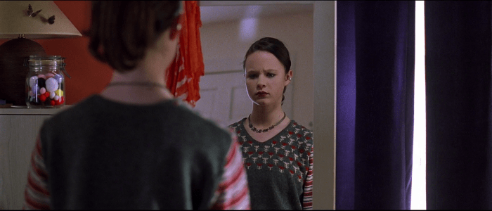
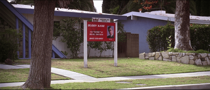
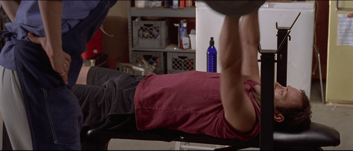
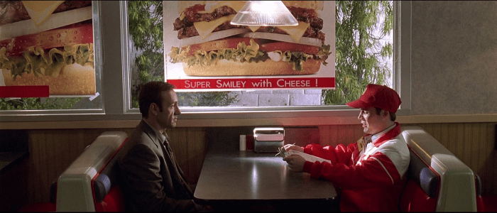
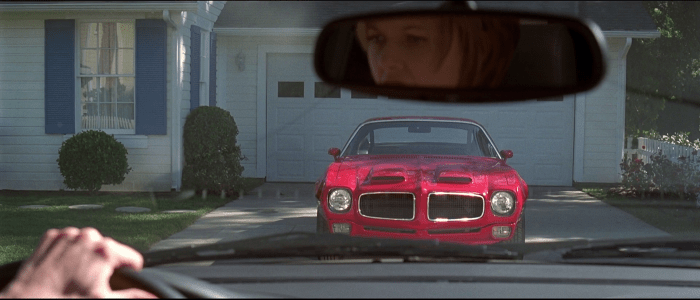
I was always aware of the color red appearing repeatedly in the movie – red is the color of roses present in several scenes, Lester’s new car (1970 Pontiac Firebird), door of Burnham’s house etc., but only recently, I noticed this color scheme: Red, blue and white. It’s hilarious how often these three colors appear simultaneously on the screen in various combinations and in various forms throughout the whole movie. Here are some examples:

Lester’s office (notice for example the handles of scissors on the table),

American Beauty (1999)

Lester’s suitcase (notice the color of papers and folders),

American Beauty (1999)

but probably the most noticeable is the Burnham’s house.

American Beauty (1999)

White walls, blue window shutters and red door. The same color scheme is found also inside the house.

American Beauty (1999)

I’m not sure what these colors mean, what do they represent and why, but they were used without any doubt on purpose. The importance of color further proves one of the first sentences of Lester Burnham: “That’s my wife Carolyn. See the way the handle on those pruning shears matches her gardening clogs? That’s not an accident.”

Maybe the color scheme shows certain stereotype, or materialistic world of Lester’s wife Carolyn (she wears colors matching the colors of their house – red, white and blue – and gets furious and angry when Lester – almost – spills the beer on the couch).

Honestly, I don’t know, what does the color scheme of red, white and blue mean. But sometimes, the questions are more important than answers. Maybe Sam Mendes doesn’t know either, or does he?

Other examples

P.S. There is a short article trying to answer, what does the color RED mean in the movie, well worth reading!